
Culture Conference
Project Overview
Objective: To design a fresh and cohesive visual identity for the Culture Conference 2024 that would capture the "Deep & Wide" theme, resonate with a young adult audience, and provide a seamless experience across all touch-points.
Project Type: Brand Identity Design
Project Length: 2 weeks
Focus: Brand Strategy, Art Direction, System Development
Role: Brand and Graphic Designer
Tools: Adobe Illustrator, Adobe Photoshop
The Challenge
Culture Conference 2024 needed a powerful brand identity that could translate its abstract "Deep & Wide" theme into a tangible, exciting visual language. The system had to be dynamic enough to engage a youth audience on social media while being structured enough for on-site signage and print materials, ensuring a consistent and memorable experience for all attendees.
My Process & Solution
My strategy was to build a flexible yet unified visual system that felt both energetic and meaningful. Every element was designed to communicate the core theme of reach (Wide) and substance (Deep).
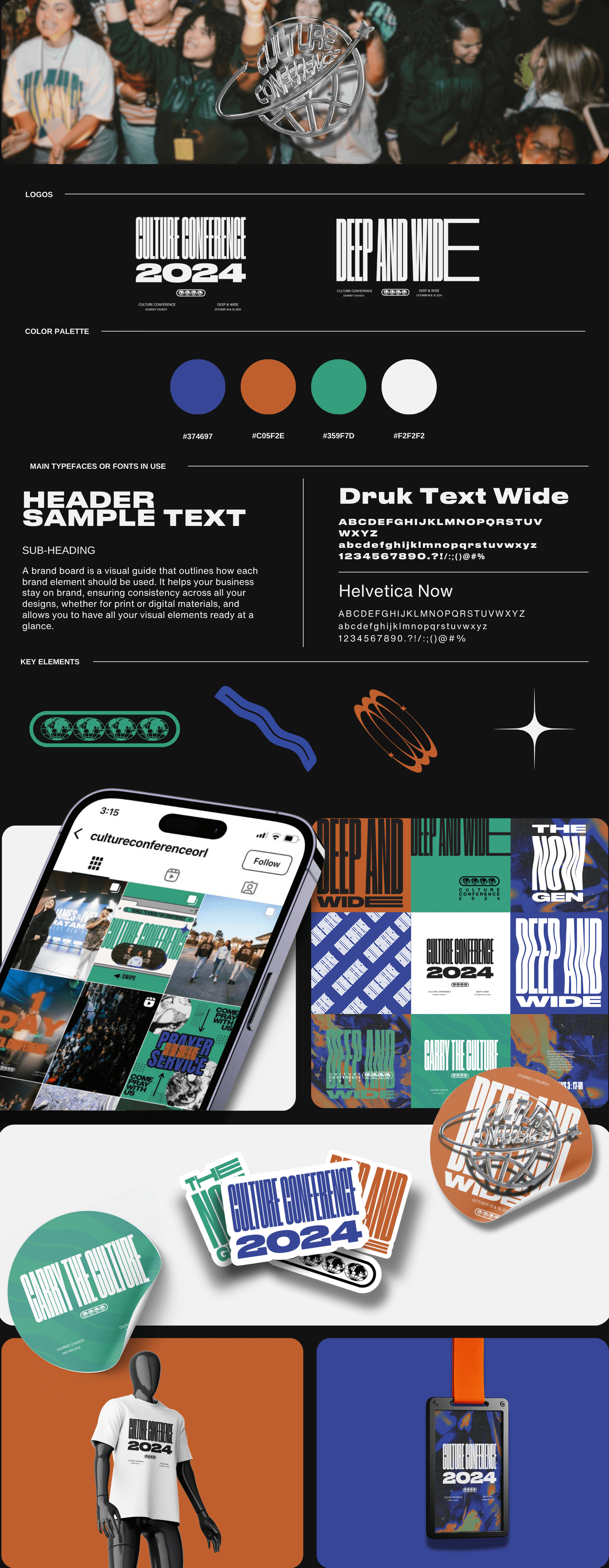
Logo & Theme Lockup: The identity needed a mark that was both iconic and adaptable.
Action: I designed a set of logos and theme lockups incorporating global and cosmic motifs, like a stylized globe.
Rationale: These elements visually represent the conference's expansive reach ("Wide") and the profound nature of its content ("Deep"), creating a versatile mark that works in various contexts.
Color Palette: The colors were chosen to create a specific emotional tone for the event.
Action: I established a primary palette of bold cobalt, earthy orange, and vivid green, balanced by clean white.
Rationale: This combination creates a high-energy, youthful feel while remaining grounded. The cobalt and orange provide dynamic contrast, while the green adds a sense of growth and stability.
Typography & Key Graphics: The visual language was built with continuity and impact in mind.
Action: I paired the bold Druk Text Wide for headlines with the clean Helvetica Now for body copy. This was supported by key graphic elements like wavy lines and starbursts.
Rationale: The typography creates a clear hierarchy, making information easy to digest at a glance. The recurring graphic motifs act as a common thread, tying all applications—from social media posts to event badges—together into one cohesive system.
The Outcome
The result was a comprehensive and energetic brand identity that successfully translated the conference's vision into a compelling attendee experience. The final system is:
Impactful: It captured the attention of the target audience, leading to higher engagement on social media and a stronger on-site presence.
Cohesive: It provided a unified look and feel across all touchpoints, from the initial promotional materials to the main stage design.
Strategic: The identity did more than just look good; it enhanced the overall conference experience by visually reinforcing the core "Deep & Wide" theme.