
Fetch: Pet Adoption App
Project Overview
Fetch is a mobile platform designed to simplify the pet adoption process. Adopting a pet online can easily become overwhelming and disjointed due to a lack of clear shelter information, hidden fees, and confusing communication channels.
This project was completed as an academic case study, focusing on restructuring the mobile experience to give prospective owners full financial and medical transparency upfront while transforming a basic scheduling form into an effortless, context-driven booking flow.
Context: Academic Project
Role: End-to-end UX/UI Designer (User research, information architecture, wireframing, and prototyping)
Timeline: Jan-Feb 2026
Platform: iOS / Android Mobile App
The Challenge
Finding a pet to adopt online is often a daunting, time-consuming task for prospective owners. Many existing platforms lack user-friendly interfaces, comprehensive search tools, and reliable communication options between adapters and shelters.
To better understand where the system was failing users, I mapped out four primary pain points that stand in the way of a successful adoption process:
Search Hurdles: High difficulty finding adoptable pets that match specific criteria like breed, age, size, and location.
Information Gaps: A distinct lack of critical details on pet profiles, including personality traits, medical history, and behavioral assessments.
Platform Skepticism: Hesitation and safety concerns regarding the overall legitimacy and reputation of online pet listings.
Hidden Logistics: Confusion and frustration caused by a lack of upfront transparency around adoption fees, requirements, and individual shelter policies.
User Research & Methodology
To evaluate how easily prospective owners could navigate the app and determine if the interface built adequate trust, I designed a targeted usability study.
Our Target User Group: Active prospective pet owners or individuals who finalized an adoption within the last year, who are comfortable navigating standard mobile marketplaces or e-commerce apps.
Core Research Goals: I wanted to see exactly how the search and filtering layouts helped or hindered users, and whether the profile information effectively lowered user anxiety regarding platform legitimacy.
What the Users Told Us (The Feedback)
Following initial usability testing, I received direct feedback that highlighted major friction points in our early concepts:
"I felt really hesitant because there isn’t any upfront mention of adoption fees or health/vaccination status on this screen. I’d worry about getting emotionally invested and then finding out late that the fee is out of my budget."
— On the Pet Profile Screen
"When I clicked ‘Meet’ and arrived at the scheduling page, it felt incredibly sterile and disconnected. It just shows two blank, manual text boxes for the date and time."
— On the Scheduling Screen
"The advanced filters screen has all the granular options I need, but it took me a few seconds to realize that the small funnel icon right next to the search input was the interactive element..."
— On the Home & Filters Screen
The Evolution: Turning Insights into High-Fidelity Solutions
Using these direct user insights, I shifted the information architecture and updated the interface components to eliminate user friction and build credibility.
The Pet Profile: Designing for Upfront Trust
The Pivot: Early layouts omitted medical histories and clear costs, leaving users anxious about platform credibility.
The Solution: I modified the information architecture by introducing a scannable horizontal row of pill-shaped metadata badges directly below the pet's primary tags. As seen in the high-fidelity mockup for Cooper, displaying a clear "Fully Vaccinated" badge alongside a transparent financial chip ("Fee: $250") relieves anxiety during the browsing phase and gives users the confidence to move forward.
The Scheduling Flow: From Sterile Form to Contextual Booking
The Pivot: The initial scheduling page forced users to manually type dates into empty boxes, losing all visual context of the animal they were trying to meet.
The Solution: I transitioned the layout into an intuitive, context-driven workflow. I anchored a structured summary card at the very top of the screen showing the pet's thumbnail photo and the rescue center's name. I then replaced the blank text inputs with friendly, touch-target components: a clean interactive calendar grid and quick-tap time chips to make booking effortless.
Home & Advanced Filters: Clarifying the Path
The Pivot: Users found the advanced filtering tools highly useful, but struggled to locate the entry point from the primary feed.
The Solution: On the main Home Screen, I optimized the search bar area by adding a high-contrast, prominent filter action button directly parallel to the input field. This ensures that users looking for granular criteria (like gender, breed, age, weight, and fee ranges) can access the full filters page instantly without guessing.
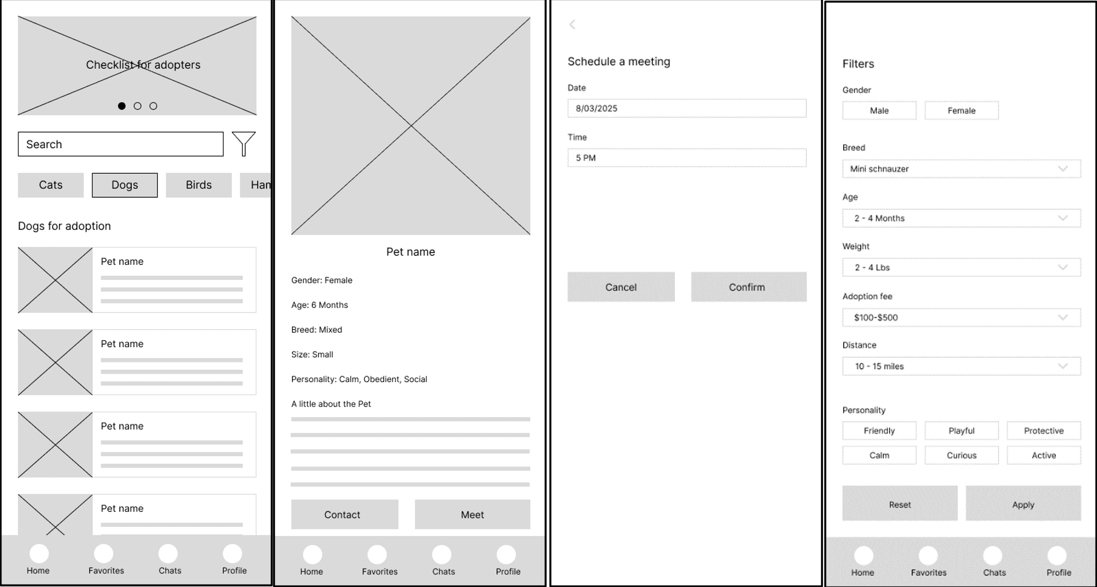
From Sketches to Pixels: Wireframes & Visual Design
Before diving into the final visuals, I mapped out the core structure using low-fidelity and mid-fidelity wireframes to ensure the user flow felt natural and completely goal-oriented.
Once the layout logic was verified, I developed a clean, welcoming visual system for the high-fidelity mockups. I chose friendly, soft color palettes and clear typography to make the pet adoption process feel less daunting and more inviting.
The High-Fidelity Mockups
Below are the final, high-fidelity designs showing how the interface evolved to prioritize user trust, clarity, and effortless navigation.
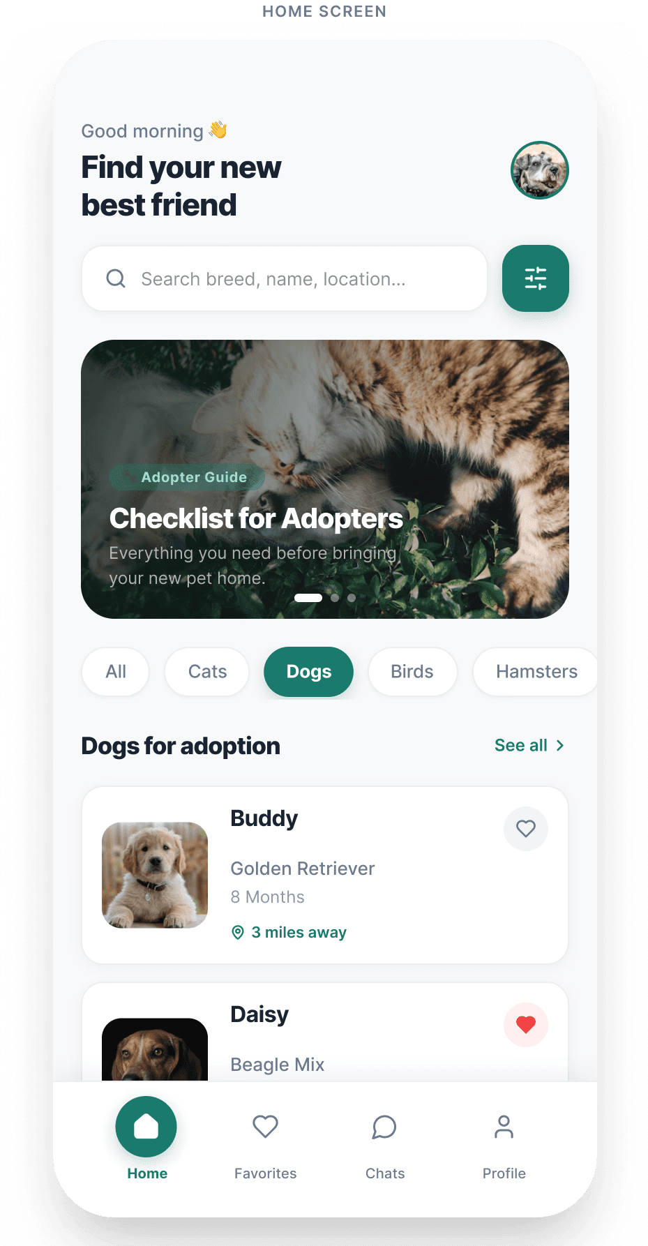
Navigating the Feed (Home Screen)
The main dashboard features a clear, accessible layout that helps users instantly browse available pets. Based on user testing, a high-contrast, prominent filter button was placed right next to the search bar to ensure users can jump straight to granular search parameters without confusion.
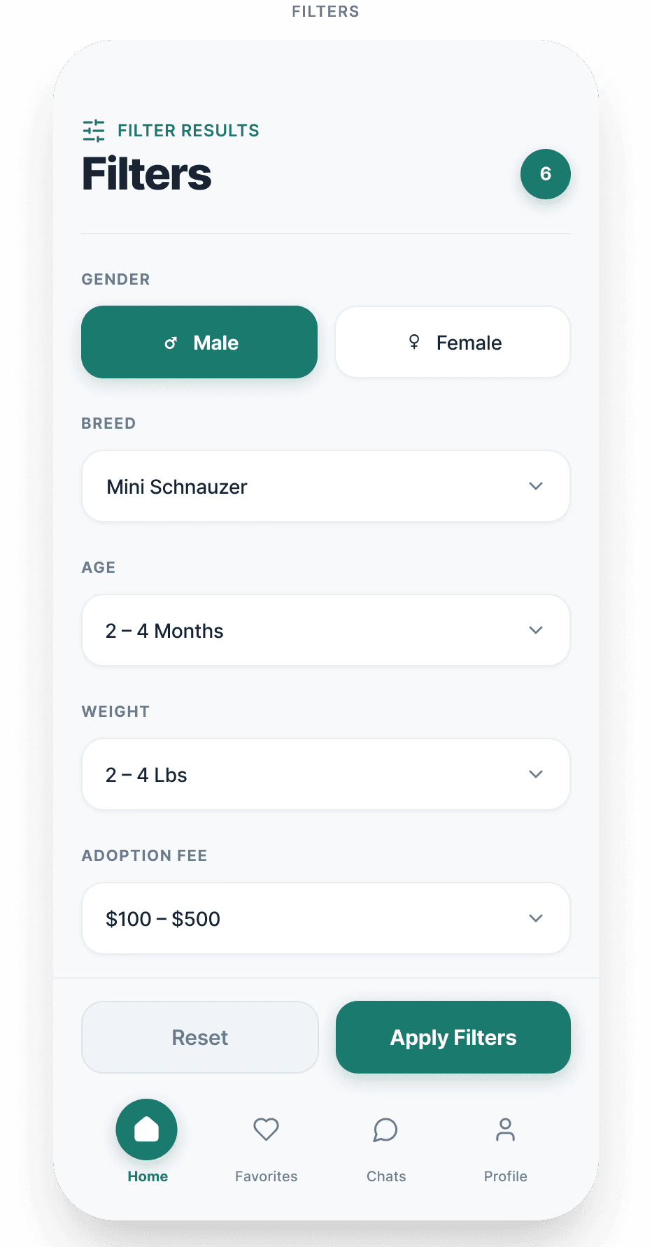
Exploring Pet Criteria (Filters Screen)
When users need to narrow down choices by specific criteria like breed, age, size, gender, or adoption fee ranges, the advanced filters page offers a clean, component-driven layout. Touch-target dropdowns make adjusting preferences effortless on a mobile screen.
Evaluating Transparency (Pet Profile Screen)
To eliminate user anxiety regarding platform legitimacy, the profile layout puts critical medical verification and clear costs front and center. Pill-shaped badges like "Fully Vaccinated" and "Fee: $250" sit right beneath the primary tags to provide full transparency before a user gets emotionally invested.

Securing Context (Scheduling Screen)
The appointment booking flow transforms a dry, text-heavy process into a smooth, contextual workflow. By anchoring a pet summary card at the top, the user never loses context of which animal they are scheduling a visit with, while an interactive calendar and selectable time chips eliminate data-entry friction.

Key Takeaways & Reflections
This project reinforced how deeply transparency affects user trust in digital marketplaces, especially when emotional choices like pet adoption are involved. By moving critical financial and medical data to the forefront of the information architecture and swapping manual inputs for component-driven UI, we successfully transformed user hesitation into a confident, seamless experience.