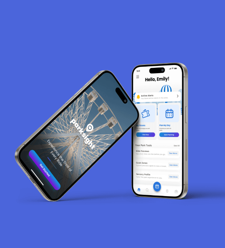
ParkSight App
Project Overview
Theme parks are built to be thrilling, but for guests with sensory sensitivities, the unpredictable combination of flashing lights, massive crowds, and sudden loud noises can quickly lead to overwhelming anxiety.
ParkSight is a mobile companion app designed to help neurodivergent guests and visitors with sensory processing needs navigate parks comfortably. By combining real-time crowd alerts, a quiet-zone navigation layer, and on-demand grounding tools, the app gives families and individuals the predictability they need to enjoy their day with confidence.
Context: Personal Portfolio Project
Role: End-to-end UX/UI Designer
Timeline: 6 Weeks
Platform: iOS & Android Mobile App
Tools Used: Figma, Miro, Photoshop, Google Forms, Zoom
The Challenge
For many families, a trip to a theme park requires days of meticulous planning, yet they still face a high risk of sensory overload. Standard park apps are excellent for tracking ride wait times, but they completely overlook the environmental factors that make or break an experience for a sensitive guest.
Through foundational user discovery, I mapped out the core frustrations preventing these visitors from having a stress-free day:
Invisible Triggers: Guests are frequently caught off guard by sudden pyrotechnics, intense audio cues, or bottlenecked, claustrophobic paths.
Blind Spots in Planning: It is incredibly difficult to plan a day when accessibility information, ride-intensity breakdowns, and sensory guides are buried deep in external websites.
No Safe Haven: When a guest or child experiences sensory overload, finding a nearby, low-stimulation space to decompress is a race against time, and standard park maps offer no help.
Lack of Personalization: Every individual's sensory threshold is different. What is manageable for one person might be entirely triggering for another.
User Research & Insights
To build a tool that actually addresses these hurdles, I launched a research phase utilizing Google Forms for broader user surveys and Zoom to conduct deep-dive interviews with parents, caretakers, and individuals with sensory sensitivities.
What I Uncovered:
Predictability is the Best Coping Strategy: The absolute biggest cause of panic isn't lines or loud noises themselves, but the unexpected nature of them. Knowing what is coming allows users to prepare, like putting on noise-canceling headphones before entering a queue.
The Utility Gap: While users praised official park apps for basic logistics, they noted that the lack of real-time crowd density data or sensory alert filtering forced them to rely on unofficial forums and guesswork.
The Solution: ParkSight’s Core MVP Features
Instead of trying to redesign the entire theme park experience, I focused on designing four high-impact features that act as a personal buffer against sensory overload:
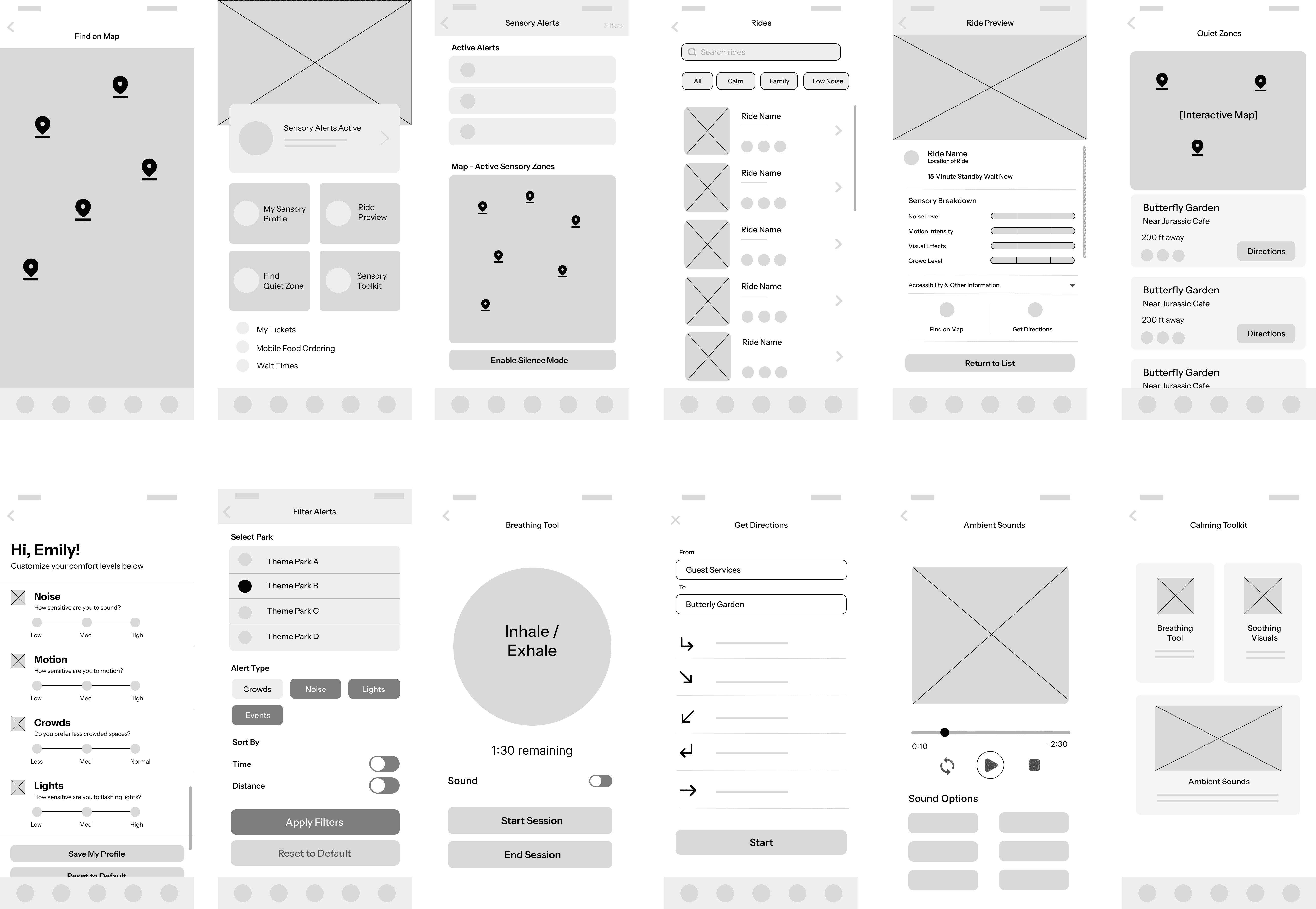
1. The Custom Sensory Profile
Because sensory needs aren't one size fits all, the onboarding flow allows users to toggle their specific sensitivities, such as high sensitivity to flashing lights, aversion to dense crowds, or low tolerance for sudden loud noises. The app then uses this profile to curate personalized attraction recommendations.
2. Real-Time Sensory & Crowd Alerts
Acting as an early-warning system, the app sends subtle, proximity-based notifications when a user approaches an area experiencing temporary high stimulation. This includes areas along a crowded parade route or near a show featuring sudden audio effects.
3. The Quiet Zone Finder
I redesigned the standard park navigation layout to feature a dedicated "Quiet Zone" toggle. With one tap, the map dynamically highlights the closest designated low-stimulation spaces, sensory rooms, or shaded, low-traffic walkways for quick, stress-free breaks.
4. In-The-Moment Decompression Toolkit
When a guest needs to ground themselves immediately, they can open an on-demand toolkit featuring quick-access, grounding resources. This includes guided breathing animations, calming ambient audio loops, and visual pacing tools designed to lower heart rates during a sensory crisis.
From Sketches to Pixels: Visual Execution
My design process moved from rough ideation flows in Miro to high-fidelity prototyping in Figma. Because the primary goal of the app is to reduce anxiety, I intentionally designed a minimalist, low-contrast interface using calming color palettes and clean, uncluttered layouts to ensure the app itself never contributes to the user's sensory load.

Reflections & Future Iteration
Designing ParkSight reinforced how deeply UX design impacts real-world accessibility. If I were to scale this project further, my next step would be integrating Bluetooth beacon technology to test the accuracy of the indoor micro-location tracking for quiet zones, ensuring that guests in deep indoor queues can still receive timely sensory alerts.
(View the Full Case Study)
Explore the full case study to see the research, design process, and key insights that shaped this project.